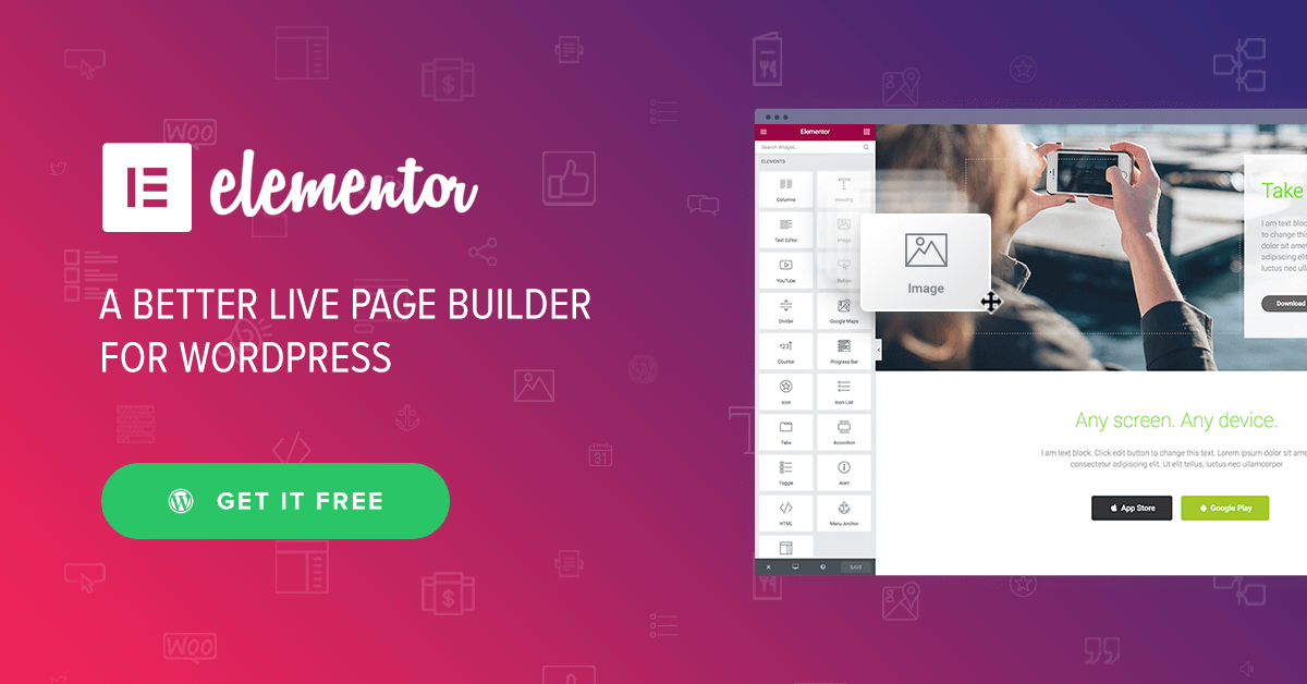
Elementor has revolutionized web design by offering a user-friendly, drag-and-drop interface that makes building beautiful and functional WordPress websites easier than ever. Whether you’re a seasoned web designer or just getting started, understanding Elementor’s best practices can significantly enhance your design efficiency and the final product’s performance. In this post, we’ll dive deep into the strategies and best practices that will help you build stunning WordPress websites with Elementor.
1. Why Choose Elementor?
Before we get into the specifics, it’s worth noting why Elementor is the go-to page builder for millions of WordPress users worldwide. Elementor stands out because of its:
- Ease of Use: Its intuitive drag-and-drop interface allows users of all skill levels to build professional websites without writing code.
- Customizability: From complete site layouts to individual elements, Elementor provides unmatched control over design.
- Speed: With real-time editing, you can see changes instantly, making the design process smoother and faster.
- Flexibility: Elementor can be used with almost any WordPress theme, offering vast flexibility in design.
2. Best Plugins to Pair with Elementor
While Elementor is powerful on its own, pairing it with certain plugins can elevate your web design to the next level. Here are some top plugins to consider:
- Essential Addons for Elementor: This plugin provides over 70 additional elements, such as advanced pricing tables, content toggles, and creative buttons, that can add depth to your site.
- Ultimate Addons for Elementor: This plugin offers pre-built website templates and unique widgets like modal popups, info boxes, and timeline widgets.
- Elementor Custom CSS: Although Elementor has built-in design flexibility, this plugin allows advanced users to add custom CSS for more control over how their elements appear.
3. Designing for Performance
One of the biggest challenges with Elementor is ensuring that your website maintains optimal performance. Here’s how you can design with performance in mind:
Optimize Image Sizes
Large, uncompressed images can significantly slow down your website. Before uploading images, use tools like TinyPNG or ImageOptim to compress your images without sacrificing quality. Additionally, you can use WebP images to improve load times on supported browsers.
Minimize Use of Heavy Widgets
Widgets like sliders, maps, and galleries can increase load times if overused. Instead, use these elements strategically, and when possible, replace sliders with static images or simpler content blocks that convey your message just as effectively.
Use Lazy Loading
Lazy loading allows images and other media to load only when they become visible in the user’s viewport, speeding up initial load times. Elementor supports lazy loading out of the box, so be sure to enable it.
Combine and Minify CSS and JavaScript
Elementor allows you to optimize your site’s CSS and JavaScript files directly from its settings panel. By combining and minifying these files, you can reduce server requests and speed up your site.
4. Creating Mobile-Responsive Designs
A mobile-first approach is essential in modern web design. Fortunately, Elementor offers built-in tools for making your website responsive. Here’s how to make the most of them:
Use Elementor’s Mobile View Mode
Elementor allows you to easily switch between desktop, tablet, and mobile views. Always design with responsiveness in mind by previewing your layout across all devices. This way, you can adjust padding, margins, and font sizes to ensure the best possible experience on smaller screens.
Adjust Fonts for Different Devices
Font sizes that look great on desktop can appear too small or large on mobile. Elementor lets you adjust typography settings independently for desktop, tablet, and mobile. Use smaller fonts for mobile devices to ensure readability and a clean, uncluttered look.
Use Percentage-Based Widths
Instead of defining element widths in pixels, consider using percentages. Percentage-based widths allow elements to resize fluidly based on the screen size, ensuring a more responsive layout.
5. Customizing Global Styles for Consistency
Consistency is key to great web design, and Elementor’s Global Settings feature allows you to set global fonts, colors, and spacing to ensure a cohesive look throughout your website. Here’s how to set it up:
Set Global Colors and Fonts
Global settings allow you to define the primary, secondary, text, and background colors for your site. Similarly, you can define fonts and typography for headings and body text. This saves time and ensures consistency, as you won’t need to manually adjust these settings for each element on your site.
Utilize Global Widgets
If you find yourself reusing certain elements across different pages—such as headers, footers, or call-to-action sections—you can save these sections as Global Widgets. This way, if you ever need to update the content or design, you can do it once, and the changes will automatically reflect across all instances of the widget on your site.
6. Mastering Dynamic Content with Elementor Pro
Elementor Pro unlocks advanced features, including dynamic content, which allows you to pull information from your WordPress database and display it on your site dynamically. Here’s how you can leverage this powerful feature:
Get Elementor Pro: https://be.elementor.com/visit/?bta=27333&nci=5709Use Dynamic Tags
Dynamic tags let you display dynamic content in any Elementor widget. For instance, you can display the current post title, author name, or even custom field data from plugins like Advanced Custom Fields (ACF). This is especially useful for blog layouts, portfolios, and product pages, where content varies from page to page.
Build Dynamic Templates
With Elementor Pro, you can create Single Post Templates and Archive Templates that dynamically pull in content based on post type, category, or tag. This means you only need to design one template, and Elementor will populate it with the correct content for each post.
Design Dynamic WooCommerce Pages
For eCommerce sites, Elementor Pro allows you to design custom product pages, checkout pages, and shop templates that automatically pull in product data, creating a unique and engaging shopping experience.
7. Using Elementor’s Theme Builder for Complete Control
One of Elementor’s most powerful features is its Theme Builder, which allows you to design and control every part of your website, from headers and footers to archives and single post templates. Here’s how to take advantage of the Theme Builder:
Design a Custom Header and Footer
Most WordPress themes come with default headers and footers, but Elementor’s Theme Builder lets you design your own from scratch. Whether you want a sticky header, a transparent header, or a footer with a custom layout, the Theme Builder gives you full control over your site’s structure.
Create Archive Pages
Archive pages, such as blog or portfolio archives, typically rely on your theme’s default layout. With Elementor, you can design a custom archive page that presents your content in a more engaging way, using grid layouts, sliders, or even custom animations.
Use Display Conditions
Elementor’s display conditions feature allows you to define where your templates appear. For example, you could create a custom header that only appears on your homepage or design a product page template that only shows for a specific product category.
8. Best Practices for Elementor SEO
Although Elementor is a visual builder, SEO shouldn’t be an afterthought. By following these Elementor SEO best practices, you can improve your site’s visibility in search engine results:
Optimize Elementor for Speed
Fast-loading websites rank better in search results. Elementor offers built-in features to help you optimize your site’s performance, such as Lazy Loading for images and videos, and CSS/JavaScript Minification.
Use SEO-Friendly Widgets
When adding text content with Elementor, be sure to use proper HTML tags (e.g., <h1>, <h2>, etc.) to maintain a clear structure. Also, include alt text for images, which is important for both accessibility and SEO.
Use Yoast or Rank Math SEO Plugins
Pair Elementor with SEO plugins like Yoast SEO or Rank Math to ensure your content is optimized for search engines. These plugins will guide you in improving your on-page SEO, including optimizing your meta tags, keyword usage, and readability.
Conclusion: Building Stunning Websites with Elementor
Elementor’s flexibility and powerful features make it the ideal tool for building stunning, high-performing WordPress websites. By following these best practices—optimizing for performance, ensuring responsive design, leveraging dynamic content, and using Elementor’s Theme Builder—you can create professional websites that not only look great but also provide an exceptional user experience.
Whether you’re designing a personal blog, an eCommerce site, or a portfolio, mastering Elementor will allow you to push your creative boundaries and build websites that stand out in 2024.


