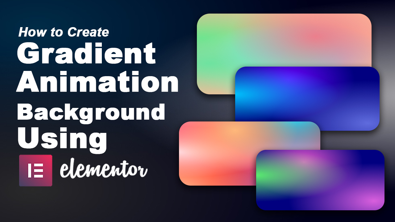
In web design, creating engaging and dynamic backgrounds can significantly enhance the visual appeal of your website. One popular technique is using gradient animations, which add a subtle yet captivating movement to your site’s backdrop. In this tutorial, we will walk through the steps to create a gradient animation background using Elementor and CSSHero’s Mesher tool, combined with custom CSS animations.
What You’ll Need:
- Elementor Pro: This tutorial assumes you have Elementor Pro installed, as it allows for easy customization with custom CSS.
- CSSHero’s Mesher: Mesher is a tool from CSSHero that helps in generating complex CSS code, including gradient backgrounds.
- Basic understanding of CSS and web design concepts.
Step 1: Generate the Gradient Background Code with Mesher
- Access CSSHero’s Mesher: Log in to your CSSHero account and navigate to the Mesher tool.
- Create Your Gradient: Use Mesher to visually create the gradient you want for your background. You can choose colors, direction, and other gradient properties.
- Generate CSS: Mesher will provide you with the CSS code for the gradient. Copy this code as we will use it later in Elementor.
Step 2: Prepare Your Elementor Section
- Open Elementor: Go to the page where you want to add the animated gradient background and edit it with Elementor.
- Add a Section: Create a new section or edit an existing one where you want the background.
- Navigate to Custom CSS: In the Elementor editor, find the section’s settings and go to the Custom CSS area.
Step 3: Add the Gradient Background CSS
- Paste Mesher’s CSS: Paste the gradient background CSS code generated by Mesher into the Custom CSS area within Elementor. This code typically looks like:
background-color:hsla(240,92%,4%,1);
background-image:
radial-gradient(at 19% 21%, hsla(210,98%,20%,1) 0px, transparent 50%),
radial-gradient(at 87% 93%, hsla(197,100%,51%,1) 0px, transparent 50%);
Step 4: Create CSS Animation for the Gradient
- Define Keyframes: Below the gradient CSS code, define your CSS animation keyframes.
- Apply Animation to the Background: Apply the animation to the background of your section
animation: gradient 13s ease infinite;
    background-size: 200% 200%;
@keyframes gradient {
	0% {
		background-position: 0% 20%;
	}
	25% {
		background-position: 100% 50%;
	}
	50% {
		background-position: 50% 70%;
	}
	100% {
		background-position: 0% 20%;
	}
}
Step 5: Save and Preview
- Save Changes: Save your changes in Elementor.
- Preview: Preview your page to see the animated gradient background in action. The gradient should smoothly transition across the defined keyframes.
Additional Tips:
- Customization: Feel free to customize the gradient colors, direction, animation speed (
10sin the example), and other properties as per your design requirements. - Browser Compatibility: Ensure to test the animation across different browsers to ensure consistent performance.
Here’s the complete CSS code for the gradient animation background that you can use in Elementor Pro’s custom CSS:
/* Define the background properties */
.bg-css {
    background-color: hsla(240, 92%, 4%, 1);
    background-image:
        radial-gradient(at 19% 21%, hsla(210, 98%, 20%, 1) 0px, transparent 50%),
        radial-gradient(at 87% 93%, hsla(197, 100%, 51%, 1) 0px, transparent 50%);
    background-size: 200% 200%;
    /* Apply animation to the background */
    animation: gradient 13s ease infinite;
}
/* Define the keyframes for the animation */
@keyframes gradient {
    0% {
        background-position: 0% 20%;
    }
    25% {
        background-position: 100% 50%;
    }
    50% {
        background-position: 50% 70%;
    }
    100% {
        background-position: 0% 20%;
    }
}


