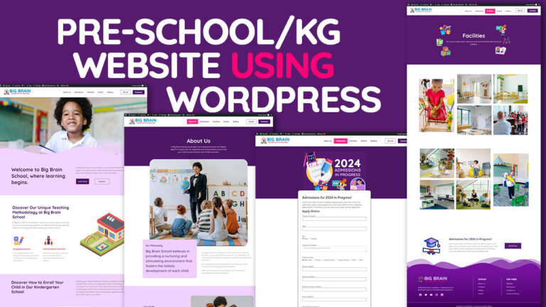
As the digital world continues to evolve, web design trends follow suit, with 2024 set to bring a host of innovative changes. The pace of technological advancements, combined with user expectations, has led to a focus on creating visually appealing, highly functional websites that prioritize user experience (UX) and accessibility. In this post, we’ll explore the top web design trends for 2024 that you should know to stay ahead of the curve.
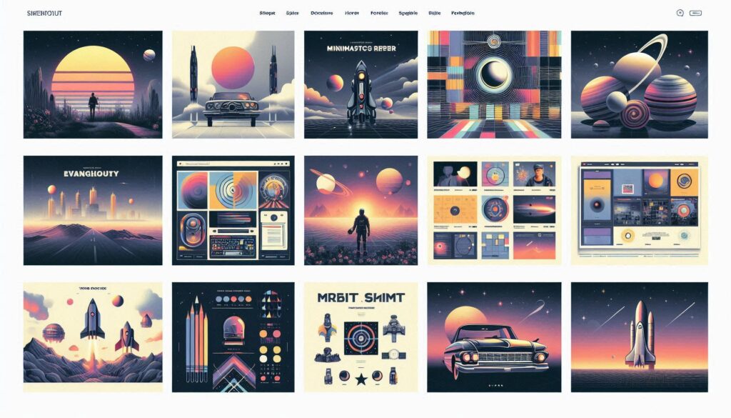
1. Minimalism: Less is More
Minimalism continues to dominate the web design landscape in 2024. A minimalist approach is all about reducing clutter and focusing on the essential elements that improve user experience. Designers are shifting toward cleaner layouts, ample white space, and the elimination of unnecessary visual elements.
Why Minimalism Works:
- Faster Load Times: Minimalistic designs typically have fewer elements, which leads to faster page load times—an essential factor for both UX and SEO.
- Enhanced Focus: By removing distractions, the user’s attention is drawn to key elements like calls-to-action, improving engagement and conversions.
- Timeless Appeal: Minimalistic designs tend to have a timeless appeal, which means your website can stay relevant longer.
How to Implement Minimalism:
- Stick to a limited color palette.
- Use large amounts of white space to make content more digestible.
- Reduce the number of design elements to only what is necessary.
2. Dark Mode: The Power of Contrast
Dark mode isn’t just a passing fad—it’s here to stay. More and more websites are adopting dark mode as an option, and for good reason. Not only does it look sleek and modern, but it also improves readability and reduces eye strain, especially for users browsing in low-light environments.
Why Dark Mode is Effective:
- Better Battery Life: Dark mode helps conserve energy on devices with OLED or AMOLED screens.
- Enhanced Readability: White text on a dark background can reduce glare and improve readability, making it a great option for websites with lots of content.
- Aesthetic Appeal: Dark mode offers a more sophisticated and elegant look, often appealing to tech-savvy and design-conscious users.
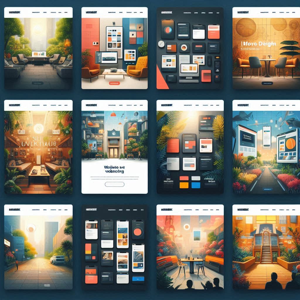
Best Practices for Dark Mode:
- Ensure color contrasts are high enough to maintain readability.
- Provide users with an option to toggle between light and dark modes.
- Use dark mode selectively for certain elements like headers, footers, or navigation bars.
3. 3D Elements and Interactive Animations
Websites in 2024 are becoming more dynamic with the integration of 3D elements and interactive animations. These features add depth and create a more engaging experience for users, making them more likely to stay on the page longer.
Benefits of 3D Elements:
- Immersive Experiences: 3D design offers a more immersive experience that can capture the user’s attention and enhance storytelling.
- Modern Appeal: Using 3D elements signals that your brand is forward-thinking and in tune with the latest design innovations.
- Higher Engagement: Interactive 3D elements encourage users to engage more deeply with your content.
How to Incorporate 3D Elements:
- Add interactive 3D buttons or icons for calls to action.
- Create 3D models of products for eCommerce websites to give users a more detailed view.
- Use 3D transitions to make the user experience more fluid and engaging.
4. Micro-Interactions: Subtle Yet Effective
Micro-interactions are the small, often unnoticed design elements that respond to user actions. From hovering effects to button animations, micro-interactions enhance the user experience by making a website feel more responsive and interactive.
Why Micro-Interactions Matter:
- Increased Engagement: These subtle effects create a sense of interaction between the user and the website, making users feel more in control of their experience.
- Guiding User Behavior: Micro-interactions can be used to draw attention to important actions, like clicking a button or filling out a form.
- Improved Feedback: Users get immediate feedback on their actions, which makes for a more intuitive and satisfying experience.
Examples of Micro-Interactions:
- Hover effects on buttons or images.
- Smooth transitions between pages.
- Notifications or small pop-ups that confirm a user action, such as adding a product to a cart.
5. Custom Illustrations: Going Beyond Stock Photos
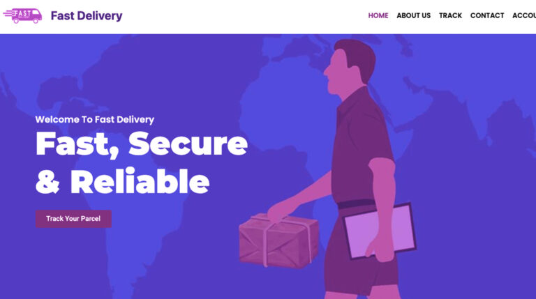
In 2024, custom illustrations are becoming a powerful alternative to stock photography. While stock photos are widely available, custom illustrations add a unique touch to your website that can make your brand stand out. These visuals not only communicate your message more effectively but also help establish a distinct identity.

Benefits of Custom Illustrations:
- Brand Identity: Custom illustrations help differentiate your website from competitors who may rely on generic stock images.
- Personalization: Tailored illustrations reflect the uniqueness of your brand and resonate more with your target audience.
- SEO Impact: Google favors original content, and custom visuals contribute to a higher ranking compared to stock photos, which may be overused on other websites.
How to Use Custom Illustrations:
- Create hero images or banners with original illustrations that capture your brand’s essence.
- Use illustrations to tell stories or guide users through processes, such as a sign-up or checkout flow.
- Consider illustrated icons for navigation and interface elements to add a playful, modern feel.
6. Responsive Design: A Mobile-First Approach
With mobile web usage surpassing desktop, responsive design has become a critical focus in 2024. A mobile-first approach ensures that websites are optimized for smaller screens, improving usability and SEO rankings.
Why Mobile-First Design is Essential:
- User Preference: More people are using their smartphones to browse the web, so ensuring that your site looks and functions well on mobile is crucial.
- SEO Benefits: Google now prioritizes mobile-friendly websites in its search rankings, making it essential for SEO success.
- Improved User Experience: A mobile-first approach ensures that users on all devices have a seamless experience.
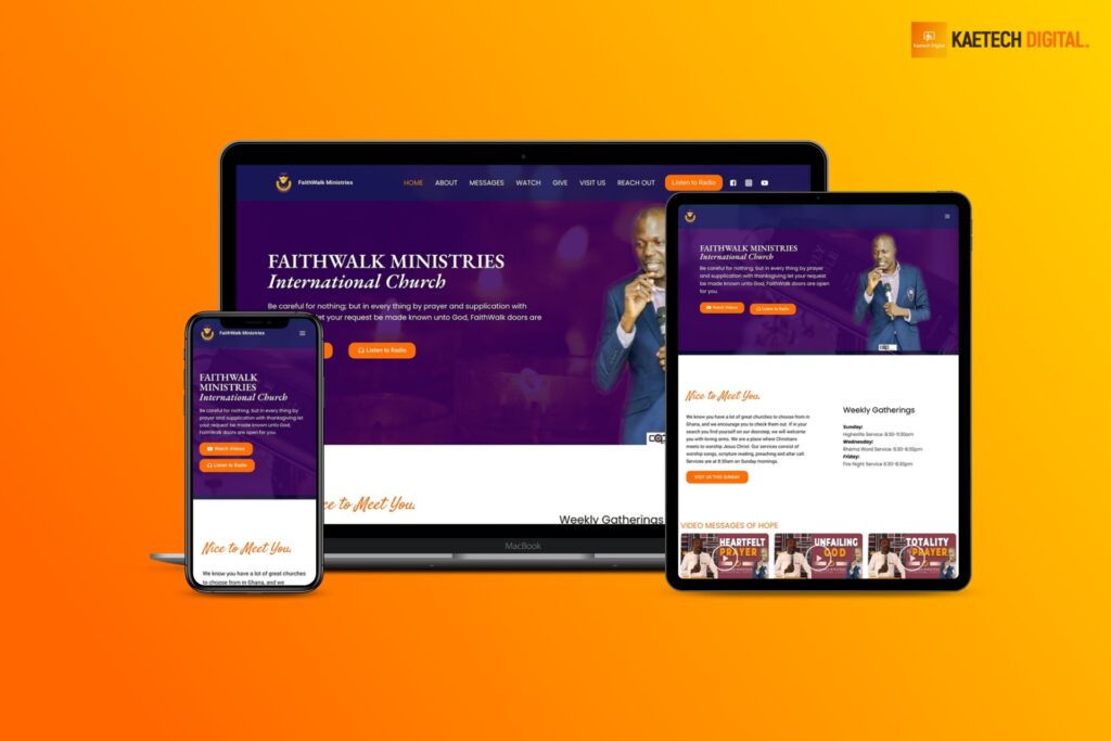
Tips for Responsive Design:
- Use flexible grids and layouts that adjust to different screen sizes.
- Optimize images and media for faster loading times on mobile devices.
- Test your design across multiple devices to ensure consistency.
7. Bold Typography: Making a Statement
Typography is taking center stage in 2024, with bold, large fonts becoming a defining feature of modern web design. Designers are using typography not only for readability but also as a focal point of the design itself. Bold fonts draw attention and help convey a message with impact.
Why Bold Typography Works:
- Readability: Large, bold fonts are easier to read, especially on mobile devices.
- Visual Hierarchy: Bold typography can help guide users’ attention and highlight important content.
- Branding: Choosing the right typography can reinforce your brand identity and make your website more memorable.
Best Practices for Bold Typography:
- Use bold fonts for headings and key messages, while keeping body text more subtle.
- Choose fonts that align with your brand’s personality—modern, classic, playful, etc.
- Combine bold typography with ample white space to maintain a clean, balanced look.
Conclusion: Stay Ahead of Web Design Trends in 2024
Web design trends in 2024 is all about enhancing user experience through clean, interactive, and visually engaging designs. By staying on top of these trends—such as minimalism, dark mode, 3D elements, and mobile-first design—you can create websites that not only look stunning but also perform exceptionally well in terms of user engagement and SEO.
As a web designer, adopting these trends will ensure that your designs remain fresh, functional, and appealing to users, keeping you competitive in the ever-evolving digital landscape.

